
Mastering Mobile App Layout Grids and Spacing
In today’s rapidly evolving digital world, the foundation of every successful mobile app lies in meticulous planning, starting with mobile app layout grids and spacing as a top priority.
Proper grids ensure that every element aligns in a consistent way, while balanced spacing makes users feel a sense of clarity and comfort.
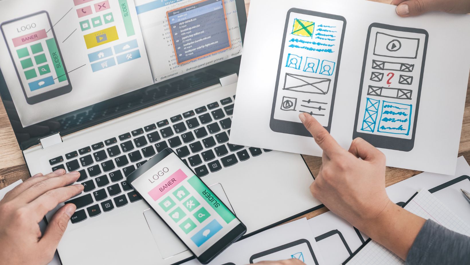
For ease of use and readability on any device, designers using an effective grid system can structure app layouts.
The layout has to be right, and this also goes beyond just making the interface “look good.”
Ensuring proper functionality, proper responsiveness, and proper delight throughout the entire user experience is what matters.
Well-chosen spacing keeps touch targets user-friendly then prevents interface crowding.
Spacing allows every element, text, image, and interactive button to shine.
This important groundwork sets the stage for each design decision.
Taking a Mobile-First Approach
Prioritizing the mobile experience is now more important than desktop.
Creating for mobile first means focusing only on what is necessary for users on smaller screens.
This plan lets designers focus their key message as distractions disappear.
Single-column designs, as well as sticky navigation bars with vertically progressive content, make mobile-first layouts thrive quite well.
These designs shine in user experience.
The prime view includes such headline content as calls-to-action, with information that is stacked vertically.
Information does not overwhelm the users; instead, it appears on a gradual basis.
Users scroll or interact, and that promotes focus from clutter.
Embracing Minimalism for Greater Clarity
Simple design is now just a trend to note in mobile app creation.
Usability involves more than looks; simplicity is necessary.
Clean layouts and pared-down features can foster more intuitive navigation.
A harmonious balance in space enables effortless interaction.
Apps that end up being friendlier and more approachable translate into a reduced cognitive load.
Minimalism’s achievement is best through typographic clarity plus restrained color palettes, plus deliberate use of white space.
Fonts that are highly readable, elements grouped decisively, with sufficient line heights ensure accessibility.
Visual flow also occurs because of these things.
Mobbin and similar tools offer inspiration because they present great minimalist layouts, which help designers simplify every new project.
Responsive Design for Every Device
A key aspect of great mobile design is adaptation.
Modern grids with layout techniques cause smooth resizing plus repositioning of elements on smartphones, tablets, and beyond.
Content can scale and reorganize automatically based on screen dimensions changing via responsive grids using flexible containers plus relative measurements.
Responsive design is not just resizing but considers all of the ways that their user might see an user.
Interfaces have to feel comfortable whether in portrait mode or in landscape mode.
Consistency can be another important factor for interfaces.
Buttons, images, and text blocks must also align and resize fluidly.
They must preserve balance and clarity at all times.
Designing for Touch: Usability and Comfort
Mobile design places importance upon the touch interactions which are accurate and also comfortable.
When the ideal design spaces out touch targets, users can navigate easily without frustration.
Minimum dimensions are vital for interactive parts.
Accidental taps get reduced when these elements have been surrounded via ample space, such as buttons and toggles.
Touch-friendly apps consider single-handed use because they place important controls within easy thumb reach as well.
Usability that is one-handed lets many users access resources and feel satisfied.
Visual Hierarchy and Typographic Excellence
Establishing a clear visual hierarchy is important so as to guide users through actions and through content.
Grids plus spacing are used considerately to bring order to the layout, and primary headings, subheadings, and actionable buttons stand out.
Headlines use large bold typography to improve readability, and concise supporting text instantly communicates priorities.
Planned color with contrast use also helps direct attention, whether they highlight a key call-to-action or denote different sections of the interface.
Consistent row spacing creates a refined business image.
Margins that are consistent further reinforce this appearance.
Accessibility for Everyone
Inclusive design isn’t just a fad; it is a responsibility.
Accessibility features ensure all users can fully engage in the mobile app, including those with disabilities.
Readability is improved by high-contrast color schemes, and images feature alternate text.
Touch elements are larger as well as spaced farther apart, in fact.
Proper alignment plus space between links and buttons ease navigation: grids and spacing are key here for users.
Accessibility also means that screen readers are able to accommodate and components do have clear labels, which then improves usability and satisfaction.
Seamless Navigation and Consistency
Simple, intuitive navigation increases user confidence plus reduces friction.
Clearer menus, as well as stickier action, in addition to more logical flow across those screens, can benefit all mobile apps.
Consistent iconography and terminology, and navigation patterns within designs work to eliminate confusion.
Trust is fostered through design when confusion is eliminated.
When designers maintain uniformity across the entire app by using consistent layout grids, spacing with visual cues, designers help users feel comfortable as they explore new features or adventures within the app.
Micro-Interactions and Feedback
Micro-interactions, subtle animations, and button feedback, or confirmation cues, can provide assurance for concrete situations in which user input is receiving a response from within the app.
These slight additions cause the interface to awaken; also, easy acts change.
Delightful experiences are what you get as a result.
Button colors shift with gentle highlights, appear with tactile responses that occur to reinforce interaction, since they make navigation more engaging.
For micro-interactions, proper spacing is paramount because overcrowded elements make animations feel cramped otherwise, distracting from the positive effect these touches should provide.
Efficiency and Performance
A high-performing mobile app feels fast also well-designed.
Layout grids structure optimized spacing for short, frictionless user flows.
Reduce the number of steps to complete key tasks, and enable smart defaults.
Autofill shortcuts should also be provided in order to make experiences both swift and enjoyable.
Performance also upon visual simplicity for sure: in the event that you do reduce unnecessary assets, you will organize content, also you minimize clutter, which will aid in both speed and clarity.
Future-Proofing with Personalization and Trends
As mobile design evolves, tailoring propels this industry ahead.
For preferences, apps keep users very engaged and invested, adapting layouts, navigation, and colors.
Flexible grids allow modularity toward tailored experiences.
Content with features shows or hides dynamically because flexible grids allow modularity.
Organic shapes with soft edges plus neumorphism are of today’s trends, styles which are grounded in a clean also well-structured grid yet that break up the monotony of sharp rectangles.
Final Thoughts
Outstanding mobile design in 2025 demands that designers pay attention to layout grids plus spacing as designs adapt responsively.
If designers embrace minimalism, fortify visual hierarchy, and engineer for accessibility, then they create apps that shine across devices and user needs.
Usability, clarity, and considerate structure should exist within every interface.
Each interaction should feel effortless, consistent, also rewarding.
This disciplined and creative approach will then lead more better mobile apps since they not only look visually impressive but they also perform smoothly for everyone.